Once a software program is installed you might not like that you have to tap your feet, rub your head and shift into third as you try to edit your videos. It is not a matter of price.
It is the design of the user interface, the intended market for the software and the end product - the video. So that is why I think this is a good opportunity to look at the other side of the box. So that is why I wanted to share with you the appearance of video editing timelines.
(Hmm. Mischief is afoot. I'm not deliberately bringing in the images at a small size. In fact, I'm scaling upward and Google is scaling downward. Or it could be the template doing the dirty deed. I struggle onward and will repair as time and tears permit.)
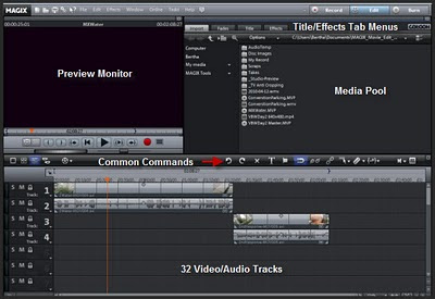
Magix Movie Edit 16 Plus Pro has a feature layout that are similar to a high end video program.

The high end programs that start at $900 and work their way up. I don't have those kinds of programs yet so this will give you an example.

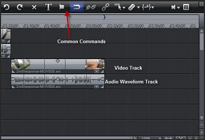
There is a common command section where you can perform the most used tasks such as adding a title, cut/splice and group or ungroup separate videos.

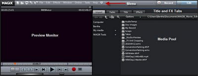
There is a monitor, a media pool where you select your images and above that you have the standard menu bar. You also have a Title and Effect Tab.
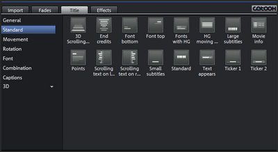
 The Title/Effects tab shows you the range of effects that you can display on your video. Lots of choices.
Before you purchase a video editing program so a bit of self-evaluation:
- Do you want to hit it and quit?
- Do you like to tinker?
- Are you the kind of person that wants to re-arraign audio and video to suit your needs?
- Is there an inner Jane Campion that is begging to come out?
No comments:
Post a Comment
I love actual comments. Please understand that comments will be held until I get a chance to look them over or wake up, whichever comes first.
Spam and other forms of hate speech are not welcome here. And due to the actions of spam bots and the people that love them moderation is in full effect.